Guns of August
Review by Paul Comben:
The Guns of August (Avalon Hill) – Rob Beyma 1981
 In some ways the biggest draw for this game was also its biggest issue. The land fronts of the First World War had not gone entirely without treatment prior to the release of Rob Beyma’s design, but compared to the massive attention the hobby had already given to conflicts such as the Nazi/Soviet struggle and the battles of the Napoleonic and American Civil War, the coverage was sparse and distinctly outside the mainstream.
Despite the campaigns of the 1914-18 period being much more in vogue today, lingering traits of that former disregard still exist – I can only think of one game that covers the full bloody extent of The Somme (ATO’s The Big Push); a handful covering Verdun; and none whatsoever portraying the entire scope of Passchendaele. There was perhaps a truth staring gamers in the face from early in the history of the hobby; one that designers repeatedly sought merely to endure, or somewhat tamely work around, or perhaps even totally ignore, but which they rarely sought a 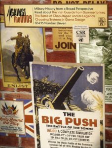 true alternative to. What was this truth? That the standard forms of the hobby could not readily accommodate every last conflict that it wished to portray. Among other subject matter, this was especially true of the grinding attrition of many Great War situations, which, in the orthodox way of doing things, were going to result in large numbers of units in large stacks largely just sitting there during prolonged bouts of die rolling.
Tastes may change with time, and I for one have put on record that I enjoy Der Weltkrieg with all its potential for substantial amounts of staying stuck in the same place – more comments on that design anon. But I would not have said the same more than forty years ago, when the detailed dullness of 1914 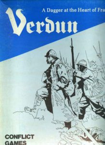 had me looking for hobby fun elsewhere; and I would not have thought any differently some ten years later, when my twenty-something self was soon disillusioned by what I personally saw as the utter tedium of Verdun – Dagger At The Heart of France. Now that is a game with a perfectly decent BGG rating, and it has its fans; all I can say for my part is that as a still relatively young gamer I soon lost interest in it, although the subject appealed very much.
The argument I am seeking to build is based on my belief that certain subjects in military history can benefit from a design approach that is outside and beyond the norms. In this regard, Jim Dunnigan’s minor classic, World War 1, rather showed the way: each turn represented several months; map was bereft of any feature outside of what was pertinent to unit function; the scale of unit was individual armies; and beyond a basic rendering of army capability, it was a nation’s pool of resource points which represented its ultimate ability to wage war. In practical terms, this approach cut out several potential pitfalls – there was no counter clutter simply because there were very few counters; and static fronts did not oppress the sensibilities because of that same lack of counters, coupled with the timescale and handling strength and resource expenditure on a simple track. Furthermore, by keeping things simple, the game was largely able to avoid anomalies arising out of more intricate mechanisms, and keep its focus exactly where the designer wanted it to be.
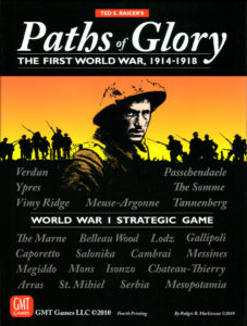 Years later, GMT’s Paths of Glory and Nuts Publishing’s To The Last Man, although far more detailed, did follow these sort of precepts – army scale, relatively simple processes governing activity on the frontline; but, in addition to those aspects, the more modern trends of the hobby were represented with the eschewing of a traditional hex grid (the point-to-point of PoG and the areas of TTLM), and something that was still pretty new at the time of PoG’s initial release but is standard fare today, an events card deck.
But back in 1981, hardly any game that was right up the rankings had anything other than a hex grid, or worked at any scale that failed to put plenty of cardboard on the map, and as for events, if you got any, it was likely to be a handful stuck on a part of a chart labeled “optional.” Thus, although the designer of Avalon Hill’s The Guns of August, judging from his notes in The General, had a very clear idea as to what he had wanted to do and what he had wanted to include, none of it was delivered by anything other than pretty orthodox means…and I suspect that was part of the reason why the game ended up with the ratings belonging to the desperately average. However, this was certainly not the whole story; and to discover that, we first need to have a look around and in the box.
The Components
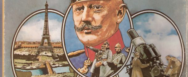
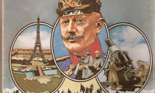
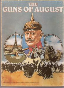 In my honest opinion, this design came with one of the best pieces of cover art I have ever seen accompanying any game. Rodger MacGowan’s artistic approach may not appeal to everyone, but on this occasion it all worked fabulously well. Rodger was certainly working with what we have come to know as his “approach” to putting a cover together – take a well known range of period illustrations or photos, give them the MacGowan treatment, and arrange the results to suit the “canvas” – that is the box cover. For this game the results were fantastic – the right photos, (Moltke, a howitzer, the Eiffel Tower, German troops in a field of wheat), the right placement, and above all else, a stunning array of applied colours. In 1981, when I saw this box on the shop shelf, I wanted the game because I simply saw the game cover; in other words, a near perfect invitation to buy and to play.
But in the very next instant, everything started going for a very Big Bertha. When I took the game to the sales point (and this was a dedicated games retailer) the chap at the till asked me if “I really wanted to buy this, as we’ve been told there a some serious problems with it.” Frankly, this was the one and only time in decades of buying games that anyone has ever said that to me. As I recall, I dismissed the caution by assuring the vendor that I had plenty of experience dealing with problems with games – which was true enough, as I had previously tussled with Gettysburg ’77 as well as a host of other designs that required a bit of attention somewhere. But The Guns of August, if I remember correctly, was a bit of a torment right out of the box.
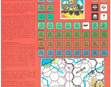
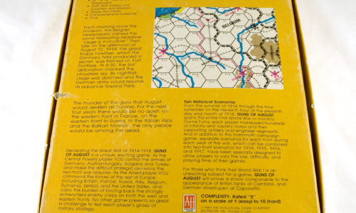
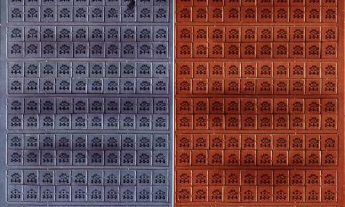
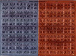
I will come to those issues in due course, but first, let us continue working through the components. The rules were hardly daunting at first inspection, and that simply in terms of being pretty short – short, unfussy rules for a game with straightforward mechanisms for a too long neglected subject. But the first problem I personally experienced was the long and wonky cuts by which the masses of corps were defined on their sheets. As I said in part one of this series, the early 1980s did see Avalon Hill have some pretty serious issues with components: the print came off of counters because of their finish, the die cutter often looked as if it had died beforehand, boards could fall to pieces (those yellow-backed horrors), and at least some charts for some games I bought around that time frayed so badly around their folds any information nearby could become illegible.
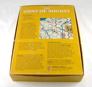
None of this was the designer’s fault; and without input I do not know how prevalent the counter issue was with this particular game. All I can say is that my counters look akin to stones from a Roman mosaic, or on their sheets, like the last placed in a “plough me a furrow” competition. As for the map, one way to put it was that it was very much of its time – you might call it utilitarian in that it only included terrain that was relevant to game function (like World War 1), but on the plus side it was mounted, and, no doubt in line with the designer’s playability concept, it did not occupy some unmanageable amount of space.
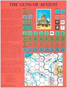 Offering criticism for the map’s minimalist look is something to approach with caution; after all, just a few years earlier, the stunning arrival of the utterly brilliant Third Reich included looking at a map that was about as minimalist as you could get. And at about the same time as The Guns of August was appearing Avalon Hill also released War and Peace, a game with plenty of style in the mechanisms, but with hardly the most attractive map in the history of the hobby.
Without doubt, map graphics have had all sorts of rethinks over the ensuing years, and were GoA or W&P to get a new edition today, or were actually appearing for the first time, the playing surface would look very different – not necessarily in adding more game detail, but in simply making the thing a more attractive proposition to look at – some period styling, maybe a look of wear and distress, the whole thing slightly offset to suggest a table present underneath etc. etc.[1]
But one always has to be careful about applying the standards of today to the products of yesteryear, and certainly the overall design layout of the GoA playing surface was not without merit in having some important game tracks on the map, along with a generous supply of holding boxes to cut down on counter clutter on those fixed fronts.
Nevertheless, even allowing for the benefits of hindsight and what we get spoilt with today, there is no escaping the fact that the Avalon Hill ratings for this game (The General Volume 18 Issue 3) were largely on the low side – and that including for the components. Beyond the box illustration, the game’s bits and pieces really did not offer any invitation to play, and claims in the response to these ratings that the counters were “some of the best Avalon Hill has done” probably produced more than a few wry smiles thirty five years ago, let alone now. Other ratings that were subpar included “completeness of rules” (frankly they were problematical), and, amongst other things, the ratings pointed to the pitfalls that can appear if simple systems do not get the sort of detail and exposition they still need. Another problem may have been (I am largely counting on my memory here) the failure to list British arrivals for the full campaign game in the game’s first edition. In that regard, I do recall feeling totally deflated the first time I got going with the game and then realized that the vendor had not been wrong to relate the experience of others purchasing the game before me.
But these matters notwithstanding, there was still a game to play, so let us see what it was like out of the box.
The System
In very broad terms, recreations of the two world wars tend to cover (or at least think about covering) three particular areas: the military/combat things; production/economy; politics/diplomacy.
If you ever have a chance to read GoA’s designer’s notes, featured in the aforementioned issue of The General, one word that crops up several times is “simple” or “simplified.” The gist of the article overall was that the designer was keen to avoid what were seen as the potential or actual pitfalls of designing a game around the main fronts of The Great War, stressing strategic decision making over the precise definition and detailing of big stacks sitting among the shell holes. Thus, anything that was perceived as slowing up the game or distracting focus was either simplified to one straightforward process or cut out altogether.
For me, although the game had mechanisms to cater for a number of combat, production, and diplomatic/political features, many were nothing more than a quick dab of a broad, and often optional, brush – e.g. production in the game’s “as is” form was largely a matter of getting what you were given. From a certain perspective it is tempting to say that too much potential content may have been edited out, and that any material which may have been omitted by dint of being likely to clog the design could really have done with being that bit more present and counting for something. I firmly believe that at one level this is often a very clever design, with some nice concepts included in the mix; on the other hand, nothing is particularly developed to turn these accents into a bigger and more involving picture.
 Most things within the second edition rules worked well enough, but nothing worked with a sense of bravado or of clever nuancing. To offer a combat example, among the optional rules was a small provision for “a big push”[2] – essentially, something like a Somme or Passchendaele situation. However, all this actually involved was being able to continue rolling combat dice until the attacker got an adverse attacker result. What was missing was any link these massive offensives had to anything else. Perhaps, with just a little bit more thought, such an attack could have been linked to national morale, and that with the attack declaration freezing units in place so that the normal defender’s combat result option of giving up the hex could not have been done without a penalty. Likewise, a stipulation on particular nationalities to launch at least “x” number of big push attacks in a given year would have had its attractions; and of course, years later, this came along at least in part in Path’s of Glory’s mandatory offensives.
However, with all three areas I listed a little earlier, the real giveaway is the material that appeared in that aforementioned issue of The General. Here there were offered, courtesy of a Leon W Tenney, a whole range of extra systems for unit production, diplomacy/politics, and naval warfare. I cannot see this gentleman’s name anywhere in the game credits, but given the detail of his work, one either has to assume that he had produced these interesting systems in the short time between the game first appearing and the ready-to-print deadline of the rather adjacent General, or they were concepts that had permeated around the design and development team, but had not made it into the final product. And yet, as appealing as a number of these ideas are, presenting them in the magazine with the caveat: “players will have to make their own counters” (and quite a lot of them) was not likely to impress that many people.
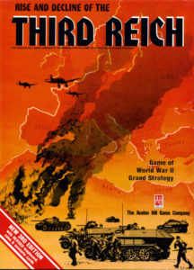 If I again refer to the earlier editions of Third Reich, none of the game’s mechanisms were particularly difficult as rules in themselves, but the challenge of understanding and working the complex relationship between resources, production and on-map effort gave the design incredible appeal. Much the same could have been the case with GoA, only it was not – for me, it was all too much meat and not enough sauce.[3] The frustrating thing is that the game seemed totally sound at a fundamental level, and the very fact that a succession of people over many years have added so much extra material is testament to how amenable the game was to elaboration, and what qualities people saw in the design “as is.” Old games that are also badly failing games do not get the sort of attention that has been lavished on this design by dedicated players. That is worthy of note in itself, and I tend to the opinion that buying this game as cheaply as it is available out there, and adding whatever files from BGG that appeal to you, will give you a perfectly valid game on a subject well worth working with.
 As for why the game fell short in the past, rule and component issues would not have helped, but fundamentally the game simply needed more “bang” (or sauce) to overcome the hobby’s then apathy towards most anything drawing on a World War One theme.
Personal rating around 6.5
In Part III I will be looking at SPI’s Plot to Assassinate Hitler.
Paul Comben
[1] There is a player-designed alternative map for W&P on BGG, and very nice it is too,
[2] I honestly cannot remember if this rule was in the first edition or came along as an extra with the second edition.
[3] Readers may wonder why a design system such as Der Weltkrieg, which in its various titles could also be seen as “far more meat than sauce” has fared markedly better than the earlier Avalon Hill GoA? Unless you are playing that utter hugeness which is Der Weltkrieg’s full campaign offering, this is, after all, a military game that is chiefly about the units dug in on the map(s) – production choices only appear in the full campaign; politics do not put in much of a showing; and there is hardly a random event to say hello to.
So why the difference in ratings?
Well, here are a few of my own purely conjectural opinions:
- Der Weltkrieg titles began to appear after a number of Ted Raicer designs had invited gamers to take another look at what could be done with the land fronts of The Great War. Basically, the subject was becoming far more popular.
- Although production did not appear as an option to work with in the theatre games, managing supply costs did – as did the accrual of points to weigh against the evaluation of national morale.
- Working at divisional level and with far more detailed maps, players possibly had a closer involvement with their front arrays in DW – be that the woods of the Argonne or a mountain pass in the Caucasus.
- Players were impressed by the sheer scope of this unfolding project, and the dedication of its designer to seeing the whole thing through.
- While there were notable issues with earlier DW rule editions and with the schedules and scenario provisions of the theatre games, in the internet age, things could be addressed far more comprehensively and swiftly than in 1981.
However, like Avalon Hill’s GoA, DW did finally fall short of providing some serious sauce in the shape of a fully evolved naval system. This was disappointing, and I suspect that fans would have far preferred to have fleets to its somewhat fiddly farms and factories production system. And while GoA only had a “Big Push” rendered with a brief stroke of a broad brush, DW has not got even that, which is a real pity.






Well, I completely disagree with most critical comments on this GoA game of AH.
First the map is AWESOME to illustrate the bland WW1 era with brownish borders and crucial blue rivers flowing through the many no mans lands of this epic war. The EU map in this GoA game is on par with the first episodes of Downton Abby: an illustration of how brownish this period looks at us … through untold pictures and dark stories, a world that exists no more …. Through its simplicity it shows something a colourful game simply can’t touch.
Secondly the massive numbers of counters per hex always reminds us of how futile corpses and the lives of young men really were in these terrible times. Dying for the fatherland is illustrated by the endless stacks of counters that lay between these dark brown borders of the map and serve to replace Army counters on the actual Fronts.
I have 2 copies of the game and my brother has one and the counters show no bad cutting or coloring at all btw. The counters are pretty much on par with the mood setting on the WW1 board. In this respect I consider Fields of Glory a total failure in map setting. Showing cheerful colors in a strategical brownish WW1 era is like wearing a red dress on a funeral…
As to the system, I have only ONE question: did you play the complete 4-5 year long Campaign with FULL resource management? I will tell you the answer: nope as can be seen by your very brief tactical descriptions. This game is NOT about an option to have a Passendael attack mechanic. This game is ALL about resource management within huge stacks of canon fodder to gain just one more hex control over a fortress and its surroundings.
I remember one particular campaign with my brother that we played for 57 hours over 4 weeks long and the final 2 rounds of fights over Verdun made the difference between a marginal and paper light victory or a draw… That game was EPIC btw both in long term planning as in short term operational nail biting combat rolls…
And EVERYONE can see this opinion if you would simply browse through the users ratings of BGG. The few guys that played the FULL Campaign game are giving it high ratings, the rest that merely browsed through it in a few turns dismiss it as boring or even too much trench WW1 like.
I am also convinced that the game was critisised for not having a well known wargame designer … That happened more than you think in the days… Like the excellent Tac Air … because it was designed by an Air Force Major who really was not into full game design (although Tac Air was even used as a wargame in the Air Force at the time).
So … as so many games these days, players just rate games without playing them decently and repeat at nausum what their brains still remember of them as a kid 30-40 years ago. The rest even rate games without setting them up, I am quite sure.
To give an example, myself I played Soldiers/SPI just recently after 37 years again and I was blown away by the simplicity and very good feeling I got from it in respect to pre trench warfare of 1914… Only the last few years the game got back some decent ratings while the + 5 year old reviews can only talk about false nostalgia which really is far from its true story
Nope dear Sir, you were wrong: Guns of August 1981 – with 2nd edition corrected play aids – from AH is still a very good representation of a strategic WW1 era game and much better than these laughable a-historical cards play and ugly “bright” map of many present day published games are.
By Paul Comben:
Hello there
The essence of my series is to look at a number of wargames that have fallen rather short in the ratings, and consider why that has occurred, and what positive qualities can still be found in the designs in question.
With GoA I think it is important to remember that this is a design from half a lifetime ago, and it is impossible to understand the experience people had with the game without looking at hobby trends and mindsets at that time. I think it would be generally accepted that there were certain preconceived notions about World War One land campaigns and game designs “back in the day,” and whether one thinks these notions were justified, partly justified or just plain wrong, they were there and had an influence.
In short, the game did not rate well in the Avalon Hill RBG from years ago, and likewise its BGG rating from decades later is also rather low. I am not rating the game personally as much as looking at why others rated it the way they did.
Given that the basis of this series is to look at games with a BGG rating in the fives, I can hardly ignore such figures or what may lie behind them. In that context, I do not think the game was helped by the issues with the first edition, and I do not think it presented enough for players at that time to challenge the sort of preconceptions I referred to – essentially, that World War One land-based designs were always in danger of being somewhat dull and a chore to work with. My personal experience, with the vendor’s warning about the feedback he had had, as well as personally discovering the range of “hiccups” with that first edition, was certainly relevant, and I sought to present it as faithfully as I could.
In all, I believe I kept things pretty much in balance. The game’s components did not rate well in The General, but I mitigated the look of the board by comparison to other “Europe” boards from better received games (3R and W&P), and qualified my experience with the counters by stating that I just did not know if mine was a common experience or I just got unlucky. I was also at pains to stress how much attention fans of this design have given to it (although that might also indicate how much they thought it was missing), and pointed out at least some of its better features.
With regard to how much detail I went into overall, here I am in a lose/lose situation – quite apart from the issue of just how much time I have to put these articles together. I spent a great deal of time and went into a very large amount of detail with Knights of the Air and, well,…to what effect? To date, it has not had any comment at all. I am trying to create something that people will feel comfortable about reading, and will want to read irrespective of whether they have ever seen the game let alone played it. Presenting the design within the context of the hobby’s history, for me at least, is part of this.
Regarding issues of Big Push offensives, I do think their modelling is an important aspect of Great War designs, because if they are not really there, what have you actually got? Neither a Somme or a Passchendaele is going to be readily invited by the game’s “geometry,” or its somewhat sparse reflection of national characteristics, or the military mindsets. And as I said earlier, there has been enough added to the game by its fans to suggest that other additions would hardly seem out of place to augment the meat and bones of the design “as is”.
Finally, I suppose one measure of a game’s presence in the hobby is whether it leads, directly or indirectly, to something more using the same mechanisms or on the same or closely related theme. At about the same time GoA appeared, Avalon Hill also released Storm over Arnhem – whose design model was then employed for Thunder at Cassino, Turning Point Stalingrad, Breakout Normandy, and many other games right up to the present. In more recent times, Paths of Glory was at the commencement of a system and theme expansion which has included Pursuit of Glory, the forthcoming Illusions of Glory, and which has additionally helped place land games of The Great War, irrespective of their design model, in a prominent place in the hobby’s output.
Whatever merits I or any other person finds in 1981’s GoA, it did not, even inadvertently, open up larger markets for World War One designs by anything it originally was. The enthusiasm that some designs engender for more of the like does not seem to have been there.
But many thanks to you for taking the trouble to write such a detailed and considered response to my article. It is very much appreciated.
Paul
I still own the game myself, and have been intrigued by the possibilities. One problem for me was that the units seemed too generic at times. That wasn’t too bad, but the U.S. order of battle turns out to be rather fictional (for instance, there should at most be one cavalry division); also, given the varying quality of divisional units, we should see some variation in factors. The 2nd Division was considerably different from the 93rd!
I soon ran out of entrenchment and fort counters. This was at a time when crafting one’s own was not as easy as it is today with desktop publishing. The tracks on the sides of the board were hard to work with, but still useful if your table space is limited. (The Europa solution was to provide displays, but those could get out of hand.)
The naval expansion was also too generic for my taste. The quality of dreadnought battleships increased dramatically between 1905 and 1918, for instance.
The lack of provision for a proper Plan 1919 was also a flaw. I understand counter limits, but to see American tanks and railroad guns (this last appeared in an aftermarket expansion), as well as more Allied tank counters, would have been nice. I’m uncertain about bombers, which were coming into their own.
Speaking of the aftermarket, there were a couple of nice expansions, such as the detailed rules in Battleplan #5 (I put this up on BoardGame Geek)
and Tom Cundiff’s The Rails of August.
In general, your review was excellent, and highlighted most of the flaws in a decent game.
Hello Philip
People have indeed put a serious amount of effort into creating variants and extras for this design, which from a certain perspective rather suggests that it was perceived as wanting in its “as is” version.
For me, it’s very much a product of its time, with a great deal of process going on, but not much by way of flair. If I look at the range of more recent and similar scaled WW1 designs, the difference today in what designers pick out and employ is pretty stark.
Thanks for liking the review.
Paul